Mental Health Color: What Green Means and How to Use It Thoughtfully
The most widely recognized mental health color is green. You may see it in a ribbon, a green heart, a social post during Mental Health Month, or a public building lit green in May. The idea is simple: green gives people a shared visual cue for awareness, support, renewal, and open conversation about mental well-being.
Still, a color is only a symbol. It can help people talk about mental health with less awkwardness, but it cannot tell you what someone is experiencing or what kind of support they need. If seeing a mental health color makes you wonder about your own stress, mood, anxiety, or resilience, a structured mental wellness self-check can be a calmer next step than trying to interpret a symbol as a personal answer.
What Color Represents Mental Health?
Green is the color most commonly used for general mental health awareness. It often appears as a green ribbon, green lighting, green clothing, green social graphics, or a green heart emoji. In many awareness campaigns, green suggests growth, renewal, hope, and the possibility of feeling supported rather than hidden.
That does not mean every mental health topic uses the same shade of green, or that green is the only relevant color. Awareness colors can vary by country, organization, condition, campaign, and community. Some groups use light green, teal, blue, purple, yellow, or other colors for specific mental health themes. For everyday search intent, though, when people ask "what is the color for mental health?" the short answer is usually green.
The longer answer is more useful: green works best as a public symbol, not a personal label. Wearing a green ribbon may communicate support. Posting a green heart may signal that mental health matters to you. Lighting a landmark green may invite public conversation. None of those choices reveals a person's private situation, and none should be used to make assumptions about someone else's well-being.
Why Green Became the Mental Health Awareness Color
Green fits mental health awareness because it carries associations that feel gentle and constructive. In nature, green often points to living things, restoration, spring, and growth after a difficult season. Those meanings translate well into mental health advocacy, where the goal is not to make distress more dramatic, but to make care, understanding, and conversation more visible.
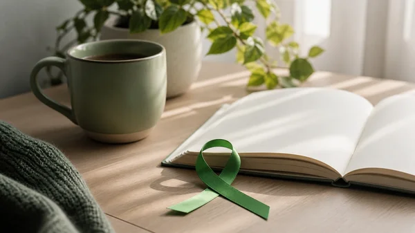
The green ribbon is especially common in mental health campaigns. A ribbon is easy to wear, share, print, or add to a graphic, so it turns an abstract topic into something visible. For many people, that visibility matters. It can say, "This topic belongs in ordinary conversation," without requiring anyone to disclose private details.
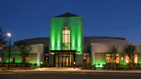
Mental Health Month, observed in May in the United States, is one of the clearest times green appears in public awareness work. Buildings, bridges, offices, schools, and community spaces may use green lighting or green materials to mark the month. This kind of visual signal can reduce silence around mental health, especially when it is paired with practical education, supportive language, and clear information about where people can seek help.
Green also has a calmer tone than colors that imply emergency or alarm. That makes it a good fit for general awareness. Mental health conversations often need enough seriousness to be respectful, but enough gentleness to keep people from feeling pushed, exposed, or judged.
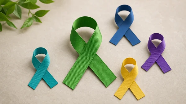
Mental Health Ribbon Colors and Related Meanings
The green mental health ribbon is the best-known general symbol, but ribbon colors are not always universal. Before using a ribbon color for an event, fundraiser, school campaign, workplace message, or public post, check the organization or campaign you are supporting. A color that means one thing in one context may mean something more specific somewhere else.
Here is a practical way to think about common mental health colors:
| Color | Common use or association | Thoughtful use |
|---|---|---|
| Green | General mental health awareness, support, renewal | Use for broad mental health awareness and anti-stigma messages |
| Light green | Sometimes used for specific mental health causes or youth-focused awareness | Check the campaign context before assigning a fixed meaning |
| Blue | Calm, steadiness, reflection; sometimes connected with anxiety themes | Use carefully, because blue can feel soothing to some and heavy to others |
| Purple | Reflection, dignity, creativity; used by some condition-specific campaigns | Avoid claiming one universal meaning unless a campaign defines it |
| Yellow | Energy, visibility, hope; can also feel intense | Use softer shades when the goal is calm support |
| Teal | Emotional balance, care, and supportive health themes in some contexts | Confirm the intended meaning before using it as a ribbon color |
This distinction matters because many searches include phrases like "mental health ribbon colors and meanings" or "mental health awareness ribbon colors." People want a clear chart, but the safest answer is a flexible one: green is the general mental health awareness color, while other colors can be campaign-specific.
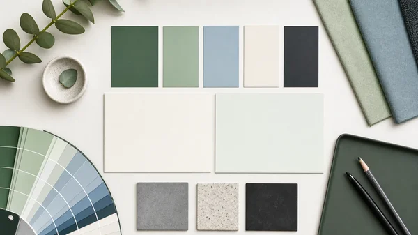
Mental Health Color Codes and Palette Ideas
If you are making a poster, resource page, classroom display, social media graphic, or wellness check-in worksheet, you may need a mental health color code. There is no single official hex code for all mental health awareness, but you can use green shades that feel clear, accessible, and calm.
Useful green examples include:
| Use | Hex code | Why it works |
|---|---|---|
| Primary awareness green | #2E7D32 | Strong enough for headings and ribbons |
| Soft support green | #66BB6A | Friendly for icons, highlights, and backgrounds |
| Deep evergreen | #1B5E20 | Good for contrast when paired with white text |
| Pale calming green | #E8F5E9 | Gentle background color for resource blocks |
For accessibility, do not rely on green alone. Some readers have color vision differences, and some people process color emotionally in different ways. Pair color with words, icons, clear headings, and readable contrast. A green ribbon beside the phrase "Mental Health Awareness" is easier to understand than a ribbon alone.
If you are designing a mental health color palette, avoid making everything green. A palette with green, warm white, deep charcoal, and one secondary color often feels more balanced than a page full of similar green shades. For calming mental health content, soft greens, muted blues, off-white backgrounds, and high-contrast text usually work better than neon colors or heavy red accents.
What Does a Green Heart Mean for Mental Health?
A green heart is often used online to express support for mental health awareness. It can mean "I care," "mental health matters," or "I support open conversation." During Mental Health Month, people may pair a green heart with personal reflections, awareness posts, resource lists, or reminders to check in with friends.
As with ribbons, the green heart is not a clinical sign and should not be treated as one. A person might use it because they support mental health advocacy, because they are sharing a campaign, because they like the color, or because they are expressing care in a simple way. It is better to ask gently than to assume.
For personal reflection, a green heart can work as a small reminder to pause. You might use it in a journal, calendar, habit tracker, or private note as a cue to ask: How has my mood been this week? What has felt heavy? What has helped? Am I avoiding support that would make daily life easier? These questions are more helpful than trying to attach a fixed emotional meaning to a symbol.

Calming Colors for Mental Health Are Personal
People often search for calming colors for mental health because they want their room, workspace, phone wallpaper, journal, or self-care routine to feel steadier. Green and blue are common choices because they are associated with nature, space, and quiet. Soft neutrals, warm whites, and muted earth tones can also help a space feel less visually demanding.
But color psychology should be used with humility. A color that feels peaceful to one person may feel dull, cold, overstimulating, or emotionally loaded to another. Personal history, culture, lighting, texture, and context all shape how color feels.
Instead of asking, "Which color improves mental health?" try a more practical question: "Which color helps this space feel easier for me to use?" For example:
- Use soft green for a journal page that invites reflection.
- Use blue-gray for a sleep routine checklist if it feels quiet to you.
- Use warm white or pale green for a reading corner.
- Use brighter green only as an accent, not across every surface.
- Avoid intense red or neon yellow in spaces meant for rest if they feel activating.
Color can support an environment, but it is not a substitute for sleep, connection, movement, professional support when needed, or honest self-observation. Think of color as a setting, not the whole story.
How to Use Mental Health Colors Without Oversimplifying
Mental health colors are most helpful when they open a door to better language. They become less helpful when they turn complex experiences into slogans or assumptions. A green ribbon can start a conversation, but it should not flatten the conversation.
If you are using green for a workplace, school, community group, or online post, keep the message specific and respectful. Instead of saying "green means everyone is okay," say "green represents mental health awareness and support." Instead of asking people to reveal private experiences, offer resources, reflection prompts, and a choice to participate.
A careful awareness message might include three parts:
- A clear symbol: green ribbon, green heart, or green lighting.
- A plain-language meaning: mental health awareness, support, and reduced stigma.
- A practical next step: reflect, talk with someone trusted, review educational resources, or consider professional help if concerns feel persistent or hard to manage.
This approach is especially important because mental health is a sensitive topic. Good awareness content should avoid fear, certainty, and pressure. It should make people feel more able to name what they are experiencing, not more worried that a color or symbol has defined them.
From Awareness Color to Self-Reflection
The mental health color conversation often begins with a public question: What color should I wear, post, or use for awareness? But it can also lead to a private question: How am I actually doing?
That second question deserves more than a color chart. If you are noticing changes in sleep, mood, stress, worry, motivation, focus, or resilience, it may help to use a more structured reflection process. MentalHealthTest.me is built around that kind of snapshot: a free, anonymous, adult-focused mental health test that looks across anxiety, depression, stress, and resilience. It is informational, not a replacement for professional advice, but it can help organize what has felt vague.
This is where a structured emotional state snapshot can connect public awareness to personal clarity. Green may remind you that mental health is worth talking about. A self-check can help you describe what you are noticing in more concrete terms.
Use Mental Health Color as a Gentle Check-In Cue
If green is the mental health color you notice most, let it be a cue rather than a label. You might wear it for Mental Health Month, use it in a campaign, add it to a resource handout, or choose it for a calm corner of your home. You might also let it remind you to pause and ask better questions about your own week.
Try a simple check-in:
- What has felt emotionally lighter lately?
- What has felt heavier than usual?
- What patterns keep repeating?
- What support would feel realistic this week?
- What would I tell a friend in the same situation?
These questions keep the symbol human. They also fit the real purpose of awareness: not to make mental health look polished, but to make it easier to approach with honesty and care. If you want a more organized way to reflect, an optional private mental wellness check-in can help you turn a broad feeling into a clearer starting point for next steps.
FAQ
What is the color for mental health?
Green is the most widely recognized color for general mental health awareness. It is often used in ribbons, green hearts, public lighting, and Mental Health Month campaigns.
What is the color for mental health awareness?
The general mental health awareness color is green. Other colors may appear in specific campaigns, but green is the clearest answer for broad awareness.
What color is the mental health ribbon?
The mental health awareness ribbon is commonly green. Some organizations may use different shades or additional colors for specific topics, so check campaign guidance when accuracy matters.
What does a green heart mean for mental health?
A green heart often signals support for mental health awareness, care, hope, or openness to conversation. It should not be used to assume anything private about a person.
What is a mental health color hex code?
There is no single official hex code for all mental health awareness. Common practical choices include deep green such as #2E7D32, softer green such as #66BB6A, and pale green such as #E8F5E9.
Is purple a mental health color?
Purple can appear in some mental health-related campaigns, but it is not the main general awareness color. Use purple only when it matches the specific campaign or message you are supporting.
What color is used for Men's Mental Health Month?
There is no single universal color for every men's mental health campaign. Green is still common for general mental health awareness, while some men's health campaigns use blue or other campaign-specific colors.
Can calming colors improve mental health?
Calming colors may make a space feel more supportive, but they are not a treatment or a complete solution. Use colors as one small environmental support alongside rest, connection, coping skills, and professional help when needed.